
Roman lettering

Roman lettering or Trajan lettering[a] refers to the use by artists and signwriters of Roman capitals in modern lettering, particularly in Britain.[10][11][12][13][14][3]
Around the early twentieth century, British artists in the Arts and Crafts movement led by Edward Johnston came to see Roman capitals as an attractive, timeless form of letters, the ideal for artistic use.[15][16][17][18] Artists who worked in this style included Johnston's pupils Eric Gill, Graily Hewitt, Percy Delf Smith[b] and MacDonald Gill,[19] as well as Reynolds Stone and many other professional signwriters and letter engravers.[20] Roman capitals were used along with lower case, Arabic numerals, italics and calligraphy in a complementary style.[21]
The style has been used for lettering where a feeling of timelessness was wanted, for example on First World War memorials and government buildings, but also on shopfronts, posters, maps, and other general uses.[22][23][24][25] The popular name "Trajan" for this style of lettering came from the lettering on the base of the Trajan Column, copies of which were often used (in theory, at least) as models by lettering artists.[22][26][3] Phil Baines commented that it became "Britain's standard style of official lettering".[27]
Use[edit]
.jpg)
.jpg)
_(cropped).jpg)
The main source studying the history of Trajan lettering in Britain is Professor James Mosley's 1964 article Trajan Revived;[30][31] and research by Dr. John Nash[20][32][33][34] and biographers of individual artists.[35]
Roman capitals were one of the main forms of lettering of the ancient world. During the Renaissance, there was considerable interest in Roman capitals,[36] with typefaces based on them.[37] However, in the eighteenth and nineteenth century types and lettering in the Didone or modern serif style tended to a style with sharp contrast in stroke contrast and capitals of near equal width.[38][39][c] This was copied into display typefaces and lettering of the time, like fat faces[41] and sans-serifs.[40][42][43][44]
Johnston and his pupils[edit]

The use of Roman capitals in lettering grew out of the Arts and Crafts movement, which promoted individual craftsmanship and traditional styles of art with respect for the past.[d]
On 11 April 1898, the architect and historian William Lethaby offered Edward Johnston a job teaching illuminating and calligraphy at the Central School of Arts and Crafts in London, and Johnston began to teach classes on 21 September 1899.[46] Lethaby was keen to increase students' interest in the aesthetic value of letters.[e] Johnston rapidly built up a school of pupils very impressed with his work.[50][f]
According to M. C. Oliver, Lethaby introduced the Trajan's Column inscription to Johnston[g] and as professor of design at the Royal College of Art put casts of the inscription of Trajan's Column as a standard for students to follow.[46][h] (At the time it was normal to use custom lettering for signs because of the inflexibility of printing and reproducing large fonts before the arrival of computer font technologies.[i])
Mass use[edit]
.jpg)
_(cropped).jpg)
In his 1906 textbook Writing and Illuminating and Lettering, Johnston commented "the Roman Capitals have held the supreme place among letters for readableness and beauty. They are the best forms for the grandest and most important inscriptions" and more pithily "when in doubt, use Roman Capitals."[56] Lettering based on Roman capitals rapidly began to appear in many design manuals as a model.[57][58] Nicolete Gray commented that in the early twentieth century "it was taught in all art schools".[3]
Johnston himself generally did not do monumental and inscription design: he tended to prefer calligraphy and many of his commissions were creating documents, like charters, ornamental record books and certificates. However, his pupils such as Eric Gill and Percy Delf Smith rapidly secured commissions creating lettering in the Roman capital style that were widely seen, for example Gill created standard lettering for W. H. Smith used on their storefronts from about 1904.[59][60] The lettering used by British artists did not always follow the Trajan capital model, often adding changes such as serifs on the top of the 'M' and 'N',[61][62][63] and of course the lower case, Arabic numerals and italics which the Romans did not have.[64][j] Phil Baines commented in 2007 that "it is difficult for us now to realise how fresh the Trajan letter–with its light colour and capitals of varying width–must have appeared at that time...it swept [other designs] away and became the norm within a very short space of time."[66]
.jpg)
.jpg)
A reason for this codification to come soon after was the First World War, where savage loss of life led to the creation of many monuments and memorials. The job of designing a standard alphabet for the war grave headstones for military casualties went to Johnston pupil MacDonald "Max" Gill, and he designed an alphabet in the Roman style.[68][k] Many of the collective monuments erected by British communities to First World War and later Second World War casualties also used Roman lettering, often designed by Johnston's pupils or people they had taught or worked with.[27] The style was used very widely, however;[69] Nash comments that "the English tradition in lettering and typography...owed a great deal to its charismatic pioneers, such as Lethaby, Johnston, Gill and [Stanley] Morison. However its strength lay in the army of unsung craftsmen and women who absorbed their ideas".[70][l][m]
_(cropped).jpg)
Roman-style lettering also became used for major institutions such as the Post Office,[73][74] and (later) by the Ministry of Works,[13] on many British street signs, using a design by David Kindersley,[75][76] and on London blue plaques.[77][78][79]
Gallery[edit]
-
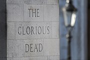 Inscription, The Cenotaph, London
 -
 War Memorial, Brighton
 -
 War Memorial, King's Lynn
 -
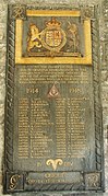 Royal Engineers memorial, Paisley Abbey
 -
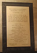 Building society foundation stone, Woolwich
 -
 Foundation stone of London Central Mosque, 1937
 -
 Plaque, Gimingham, Norfolk
 -
 Memorial to Nevile Henderson
 -
 Ceramic plaque, London
 -
 Memorial to Matthew Torrance, Magdalen Laver
 -
 Second World War memorial, Farley
 -
 Memorial to William Henry and Florence Abbey, Nuthurst
 -
 Memorial bronze, Westminster Hall
 -
 Date stone showing italic for small text, London, 1957
 -
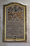 Memorial to Herbert and Freda Penelope Cayzer
 -
 Memorial to Ralph and Constantia Arnold, Swerford (after 1970)
 -
![Blue plaque designed by Henry Hooper, 1976[80]](//upload.wikimedia.org/wikipedia/commons/thumb/f/f2/In_this_house_LEONARD_and_VIRGINIA_WOOLF_lived_1915-1924_and_founded_the_Hogarth_Press_1917_%28cropped%29.jpg/172px-In_this_house_LEONARD_and_VIRGINIA_WOOLF_lived_1915-1924_and_founded_the_Hogarth_Press_1917_%28cropped%29.jpg) Blue plaque designed by Henry Hooper, 1976[80]
Blue plaque designed by Henry Hooper, 1976[80] -
 Plaque, Felsted
 -
 Plaque for Arthur and Edyth Rackham, Amberley


_-_geograph.org.uk_-_4451822.jpg)
.jpg)
.JPG)
_diplomat_memorial.jpg)


.jpg)


![Blue plaque designed by Henry Hooper, 1976[80]](/wiki/File:In_this_house_LEONARD_and_VIRGINIA_WOOLF_lived_1915-1924_and_founded_the_Hogarth_Press_1917_(cropped).jpg)


Printing types and lettering models[edit]

Some lettering artists who worked in the Roman lettering style designed typefaces. Johnston was commissioned in 1915 to design a sans-serif typeface for London Underground, which it still uses.[82] Gill designed several serif typefaces for clients and for Monotype such as Perpetua, as well as his Gill Sans sans-serif typeface.[83] Other designers who created typefaces in the style included Reynolds Stone[84][85] and (more loosely) Will Carter.[86]
Other designers such as Delf Smith created lettering manuals,[87] or models for their students and assistants.[88][89] In the United States, Frederic Goudy also designed several typefaces based on Roman capitals.[90] Other typefaces based on the style have been published as digital fonts (see below).
In other countries[edit]
Roman capitals were widely used throughout the Roman Empire. The wide use of Roman capitals as a "house style" dominating design in the first half of the twentieth century was limited to the UK; Nicolete Gray commented in 1960 that "it has been a purely English movement, and one sees no traces of it on the Continent. One does, however, see many examples in [the] U.S.A. where apart from English influence the work of the letter carver John Howard Benson has been important."[2][n]
However, other artists in the previous century had followed similar directions. In 1846 printer Louis Perrin in Lyon introduced his "Caractères Augustaux" typeface, based on Roman capitals in local collections, and added a lower case in a complementary style inspired by old-style serif typefaces from before the nineteenth century.[92][93] Other typefaces reproducing Roman capitals were produced in France in the nineteenth century, for instance for scholarly publications.[94]
In the twentieth century there was also interest in Roman capitals in other countries, including Russia.[11]
Modern situation[edit]
.jpg)

Examples of Roman-style lettering can be seen in many places across Britain.[96] Kindersley's street sign font is one of the most common designs for street signs in Britain.[75] Use of the Trajan style of lettering has declined somewhat due to changing tastes, with a desire for new styles of lettering. Additionally, custom lettering and signwriting in general has declined in use due to the arrival of phototypesetting and desktop publishing, making it possible to print from a computer font at any size.[97][53][98][99][100] Meanwhile, some lettering artists who do create artistic work have switched to other more expressive styles, including sans-serifs.[101][102][o] Among historians of lettering, Gray and Mosley both were interested in other styles of lettering, with Mosley particularly arguing for the importance and beauty of the "vernacular" lettering styles that Trajan-style lettering tended to replace.[105][106][107][108][109][p]
Among digital fonts, Adobe Systems' digital typeface Trajan by Carol Twombly is one of its most popular typefaces.[112][113][114][115][116] Several digital fonts specifically based on British artists' use of Trajan lettering have also been published.[117][24][118][119][120][121][122][76][123]
Notes[edit]
- ^ "Trajan" was often used as a shorthand for the style of lettering, or at least the capitals, especially later on, see for example Nash, who says that "what was beginning to be called the 'Trajan letter' [became] a basic form to be taught to art schools",[1] Nicolete Gray, who comments that "Trajan is now also a trade term"[2] and "to avoid confusion, I shall refer to this letter as 'Trajan'".[3] However, especially by those who introduced the style, the more accurate term "Roman lettering" or similar was used, for example by Johnston (Roman capitals),[4] Evetts ("Roman Lettering"),[5] Delf Smith, who called his workshop the Roman Lettering Company,[6] and Lubell, who describes the style as "the revival of the classic Roman Inscriptional capitals in early twentieth century England"[7] and "adherence to a Roman exemplar",[8] although this can be confused with Roman capitals in general or with Roman type. Nash describes it as the "Johnston-Gill tradition".[9]
- ^ Percy Delf Smith was born Percy John Smith, taking his wife's surname of Delf after his marriage. For consistency, this article refers to him as Delf Smith throughout.
- ^ In other words, the opposite of the Roman capital model of capitals of widely varying width.[40]
- ^ Categorising the artists who worked in the Roman lettering style as Arts and Crafts movement is of course a simplification, as they came later than early figures in that trend such as William Morris: Nash comments that "Gill, who spent much of his life scorning that very movement and considered himself nothing if not forward-looking, would have been most irritated."[45]
- ^ Lethaby had written in an education report shortly before meeting Johnston for the first time that students' lettering was "almost without exception bad. Such students as endeavour to apply lettering harmoniously to their designs seem to endeavour to invent new and contorted forms out of their heads."[47][48] Johnston was offered the job on 11 April 1898, but because of Johnston's lack of confidence and difficulties in starting the class it began the following year.[49]
- ^ Johnston's teaching notes have survived: pupils present on 21 September included Noel Rooke and Florence Kingsford Cockerell, with T. J. Cobden-Sanderson, Graily Hewitt and Percy Delf Smith taking classes with him from 1900 and Eric Gill from 1901.[49]
- ^ The Trajan Column inscription was accessible in London because of a cast in the Victoria and Albert Museum, which had been presented by Napoleon III.[51] In Mosley's view, it became a model as the "sole antique inscription of which casts were readily available" in London.[51]
- ^ Mosley notes that this was the recollection of Oliver, but cautioned that another pupil at the Central School, A. H. Verstage, "never heard Lethaby refer to the Trajan inscription".[52]
- ^ For example plotters, wide-format printers and CNC machining.[53][54][55]
- ^ Gill commented that "while we may remember Trajan lovingly in the museum, we must forget all about him in the workshop."[64][65] and that art schools were dominated by "Trajan snobbery".[63]
- ^ Max Gill was Eric Gill's brother, and later married Johnston's daughter, although the commission may have came from past work he had done for prominent architect Edwin Lutyens, himself to design many First World War memorials.[68]
- ^ Nash has highlighted as a later illustration of the diversity of the style Modern Lettering and Calligraphy (1954), which shows lettering work by a huge range of artists such as William Sharpington, many little-known.[71][45]
- ^ Not everyone was impressed by the academic training of British lettering around this time. When graphic designer Becky Astbury interviewed her father George Astbury, a successful Liverpool signwriter who began his career in 1957, he commented "I was asked in the past 'are you going to night school?' and my answer was 'what the bleeding hell for'...[you'd get] taught how to create serifs with a compass. It's best to judge it by eye and get it done quickly."[72]
- ^ American writer John Nash also concurs, following James Mosley, writing that "The Roman inscriptional capital thrived particularly during three periods: in the Empire of the second century AD; in sixteenth century Italy (principally Rome); and in early twentieth century England".[91]
- ^ Nash's article on the career of Will Carter is an example of this trend: born in 1912, while his work closely followed the Johnston-Gill style he had been brought up on into his fifties, he also experimented with blunter and bolder styles, commenting in 1982 that "the cut off serif, which was extensively used in what James Mosley so aptly calls the 'English Vernacular' period...has become a great feature of my work because it never disappears from sight as soon as you stand away from it".[103] An interesting reading list illustrating what books on lettering twentieth-century lettering artists used is a catalogue of the books owned by Michael Harvey, which was listed for sale as a group after his 2013 death.[104]
- ^ Mosley also argues that Trajan lettering has been used in historically inappropriate places, such as on the eighteenth-century ship HMS Victory.[110][111]
References[edit]
- ^ Nash 2002, p. 22.
- ^ a b Gray 1960, p. 13.
- ^ a b c d Gray 2005, p. 8.
- ^ Johnston 1906, pp. 268–269.
- ^ Evetts, L. C. Roman Lettering.
- ^ Nash 2002, p. 19.
- ^ Lubell 2010, p. 22.
- ^ Lubell 2010, p. 25.
- ^ Nash 2002, p. 27.
- ^ Gregory, Richard. "The English Signwriting Tradition". Richard Gregory Signwriter. Retrieved 26 August 2023.
- ^ a b Zhukov, Maxim. "The Trajan Letter in Russia and America". Typejournal.ru. Retrieved 4 March 2017.
- ^ Tam, Keith (2002). Calligraphic tendencies in the development of sanserif types in the twentieth century (PDF). Reading: University of Reading (MA thesis). Archived from the original (PDF) on 2015-09-06. Retrieved 2016-10-18.
- ^ a b Mosley, James. "Number Ten". Typefoundry (blog). Retrieved 27 August 2023.
- ^ Griffith, Heather. "The Lettering Arts Trust Journeyman Scheme: Trajan Alphabet". Heather Griffith: Stonecarving. Retrieved 26 August 2023.
- ^ Mosley 1964, pp. 29–31.
- ^ Howes 2000, pp. 26–27.
- ^ Shaw, Paul (August 2003). "What distinguishes a good letter from a bad one?". Reed Magazine. Retrieved 3 September 2023.
- ^ Lommen, Mathieu. "'Simply phenomenal': de kapitalen op de zuil van Trajanus". Allard Pierson Museum. Retrieved 19 October 2023.
- ^ Walker, Caroline (25 December 2019). "Biography - MacDonald Gill". MacDonald Gill. Retrieved 26 August 2023.
- ^ a b Nash 2002.
- ^ Delf Smith 1936, p. 2.
- ^ a b Mosley 1964, pp. 31–35.
- ^ Gray 1960.
- ^ a b Ross, David Jonathan (29 August 2018). "August's font of the month: Map Roman". Font of the Month Club. DJR. Retrieved 26 August 2023.
- ^ Frere-Jones, Tobias. "Mallory: drawn out from memory". Frere-Jones Type. Retrieved 29 August 2023.
- ^ Mosley, James. "Eric Gill's R: the Italian connection". Type Foundry. Retrieved 26 August 2023.
- ^ a b Baines 2007, p. 23.
- ^ Specimen of Plain & Ornamental Types from the Foundry of V. & J. Figgins. London. 1845. Retrieved 27 October 2017.
- ^ Shewring, Walter, ed. (1948). The Letters of Eric Gill. Devin-Adair. pp. 435–8.
As perhaps you know, I was a pupil of Edward Johnston and was living almost next door to him when he was designing the LPTB sans-serif. It was a revolutionary thing and as you know, it redeemed the whole business of sans-serif from its nineteenth-century corruption. It was not until 1927 that I was asked by the Monotype Corporation to do a sans-serif for them.
- ^ Mosley 1964.
- ^ Nash 2002, p. 15.
- ^ Clinton, Jane (5 May 2017). "Expert who hones his skills to the letter". Camden New Journal. Retrieved 26 August 2023.
- ^ "John Nash". The Lettering Arts Trust. 12 April 2018. Retrieved 26 August 2023.
- ^ "John Nash". The Art Workers’ Guild. Retrieved 26 August 2023.
- ^ Mosley, James. "RBS Preliminary Reading List: James Mosley, Type, Lettering, and Calligraphy, 1830-1940 (and Beyond)". Rare Book School. Retrieved 26 August 2023.
- ^ Shaw 2017, p. 19.
- ^ Vervliet 2008, pp. 66, 77.
- ^ Shaw 2017, p. 102.
- ^ Johnston, Edward. Writing, Illuminating and Lettering. p. 233.
[In the] nineteenth-century style...it was customary to make every letter occupy the same space and look as much like its neighbour as possible.
- ^ a b Gehlhaar, Jens. "Neuwelt: An optimistic transatlantic sans serif type family — Jens Gehlhaar". Jens Gehlhaar. Retrieved 15 December 2021.
- ^ Shaw 2017, p. 121.
- ^ Majoor, Martin (29 November 2004). "My Type Design Philosophy". Typotheque. Retrieved 12 November 2015.
- ^ Tankard, Jeremy. "The design of Pembroke". Jeremy Tankard Typography. Retrieved 26 August 2023.
- ^ Berry, John D. "A Neo-Grotesque Heritage". Adobe Systems. Retrieved 26 August 2023.
- ^ a b Nash 2002, p. 26.
- ^ a b Mosley 1964, p. 29.
- ^ Keeble, p. 23.
- ^ Keeble, Brian (2009). God and Work: Aspects of Art and Tradition. World Wisdom, Inc. ISBN 978-1-933316-68-0. Retrieved 23 September 2023.
- ^ a b Howes, Justin. "Edward Johnston's first class at the Central School on 21 September 1899". Edward Johnston Foundation Journal: 11–14.
- ^ Nash 2002, pp. 18–19.
- ^ a b Mosley 1963, p. 49.
- ^ Mosley 1964, p. 30.
- ^ a b Simonson, Mark. "Not a font". Mark Simonson Studio (blog). Retrieved 14 December 2016.
- ^ Gregory, Richard. "The Machine Age". Richard Gregory Signwriter. Retrieved 23 September 2023.
- ^ Gregory, Richard. "The Modern Age". Richard Gregory Signwriter. Retrieved 23 September 2023.
- ^ Johnston 1906, p. 269.
- ^ Mosley 1964, pp. 30–31.
- ^ Payne 1921.
- ^ Howes 2000, p. 26.
- ^ Nash 2002, p. 18.
- ^ Delf Smith 1936, p. 28.
- ^ Delf Smith 1946, pp. 20–21.
- ^ a b Gill, Eric. "Alphabet and Numerals". Tate. Retrieved 20 September 2023.
- ^ a b Nash 2002, p. 24.
- ^ Gill 1936, p. 58.
- ^ Baines 2007, p. 22.
- ^ Day, Michael. "A Museum Clerk at the Battle of the Somme". British Library. Retrieved 27 August 2023.
- ^ a b Musson, Jeremy (23 October 2020). "Charting a Life: MacDonald Gill, who designed the inscriptions that form an egalitarian monument to the British and Commonwealth fallen of two world wars". The Art Newspaper. Retrieved 2 September 2023.
- ^ Vanson, Arthur. "Essendine". Bucks Signs. Retrieved 4 September 2023.
- ^ Nash 1989, p. 13.
- ^ Holme, Rathbone; Frost, Kathleen M. (eds.). Modern Lettering and Calligraphy. The Studio Publications.
- ^ Astbury, p. 33.
- ^ Stamp, Gavin (9 April 2012). "Architects who put their stamp on the Post Office (letter)". The Guardian. Retrieved 10 September 2023.
- ^ Mansell 1931, pp. 31, 34.
- ^ a b Hall, Alastair. "London street name fonts". We Made This. Retrieved 18 September 2023.
- ^ a b "Type design". The Cardozo Kindersley Workshop. Retrieved 18 September 2023.
- ^ Gibbs 2005b, pp. 6–7.
- ^ Gibbs, Jon (23 March 2005). "Obituary: Henry Hooper". The Independent. Retrieved 21 September 2023.
- ^ "The Changing Face of Blue Plaques". English Heritage. Retrieved 21 September 2023.
- ^ Gibbs 2005b, p. 7.
- ^ Delf Smith 1946, p. 31.
- ^ Howes 2000, p. 28.
- ^ Mosley, James. "Eric Gill and the Cockerel Press". Upper & Lower Case. International Typeface Corporation. Archived from the original on 29 July 2012. Retrieved 7 October 2016.
{{cite web}}: CS1 maint: bot: original URL status unknown (link) - ^ Devroye, Luc. "Reynolds Stone". Type Design Information. Luc Devroye.
- ^ "The legacy of Reynolds Stone". BBC News. 21 September 2009. Retrieved 18 September 2023.
- ^ Devroye, Luc. "Will Carter". Type Design Information. Luc Devroye.
- ^ Delf Smith 1946, p. 21.
- ^ Nash 1989, p. 14.
- ^ Sharpington, William. "Roman and Italic capitals". Crafts Study Centre. Retrieved 27 August 2023.
- ^ Goudy, Frederic (1936). The Trajan Capitals. Oxford University Press.
- ^ Nash 2002, p. 11.
- ^ Ovink, G.W. (1971). "Nineteenth-century reactions against the didone type model - I". Quaerendo. 1 (2): 18–31. doi:10.1163/157006971x00301. Retrieved 20 February 2016.
- ^ Mosley, James (2003). "Reviving the Classics: Matthew Carter and the Interpretation of Historical Models". In Mosley, James; Re, Margaret; Drucker, Johanna; Carter, Matthew (eds.). Typographically Speaking: The Art of Matthew Carter. Princeton Architectural Press. p. 31. ISBN 9781568984278. Retrieved 3 September 2023.
- ^ Mazé, Charles (29 June 2021). "Abîmées". ABYME. Retrieved 3 September 2023.
- ^ Nash 2002, p. 25.
- ^ Nash 2002, passim.
- ^ Astbury, p. 36.
- ^ Johnston, Alastair. "The Misery of Edwin Drood". Booktryst. Retrieved 14 December 2016.
- ^ Shinn, Nick. "The Golden Age of Hand Lettering in American Advertising". Type Culture. Retrieved 1 April 2017.
- ^ Dormer, Peter (16 December 1992). "Architecture: Is the writing on the wall for public inscriptions?". The Independent. Retrieved 23 September 2023.
- ^ Mosley 1964, p. 35.
- ^ Nash 2002, pp. 26–31.
- ^ Nash 2007, p. 36.
- ^ "Michael Harvey: The Art of Lettering" (PDF). Janette Ray Rare and Out of Print Books. Retrieved 3 September 2023.
- ^ Mosley 1963, pp. 49–52.
- ^ Mosley, James. "Working Letters – an affectionate view of the vernacular". Letter Exchange. Retrieved 11 May 2023.
- ^ Walters, John L. "Review: Letters from Bologna". Eye Magazine. Retrieved 4 December 2023.
- ^ Mosley, James. "English vernacular (2006)". Type Foundry (blog). Retrieved 27 August 2023.
- ^ Mosley, James. Memory of Roman Letters.
- ^ Mosley, James. "A British National Letter". Typefoundry (blog). Retrieved 27 August 2023.
- ^ Mosley, James (14 January 2007). "HMS Victory". Typefoundry (blog). Retrieved 27 August 2023.
- ^ Berry, John. "Trajan 3 Pro specimen" (PDF). Adobe Systems. Retrieved 18 October 2016.
- ^ Riggs, Tamye (12 June 2014). "The Adobe Originals Silver Anniversary Story: Stone, Slimbach, and Twombly launch the first Originals".
- ^ Riggs, Tamye. "The Adobe Originals Silver Anniversary Story: A community perspective on the Originals program". Typekit. Adobe Systems. Retrieved 4 March 2017.
- ^ "TYPO Talks » Blog Archiv » Yves Peters: Trajan in Movie Posters". Archived from the original on 2018-07-06. Retrieved 2018-07-06.
- ^ Brown, Tim (21 March 2012). "Inscriptional faces from Adobe Type".
- ^ Smith, Jamie. "English Engravers Roman". MyFonts. Smith Hands. Retrieved 26 August 2023.
- ^ Studden, John. "Classic Roman 2". Letterhead Fonts. Retrieved 26 August 2023.
- ^ Vanson, Arthur. "Essendine 2". Letterhead Fonts. Retrieved 26 August 2023.
- ^ Summerour, Neil. "Kurosawa Serif". T26 Type Foundry. Retrieved 26 August 2023.
- ^ Summerour, Neil. "Kurosawa Serif Font". MyFonts. T26. Retrieved 26 August 2023.
- ^ Dooley, Jeremy. "Winsel". MyFonts. Insigne Design. Retrieved 18 September 2023.
- ^ Davenport, Connor. "Greenstone". Sharp Type. Retrieved 7 October 2023.
Cited literature[edit]
- Astbury, Becky. Have Brush Will Travel: the Past, Present and Future of Signwriting (Thesis). Retrieved 26 August 2023.
- Baines, Phil (2007). "Changing the World". In Clayton, Ewan (ed.). Edward Johnston: Lettering and Life. Ditchling Museum. ISBN 9780951622483.
- Bartram, Alan (1986). The English Lettering Tradition from 1700 to the present day (1st ed.). Lund Humphries. ISBN 9780853315124.
- Carter, Harry (2008). A View of Early Typography Up to About 1600. Hyphen Press. pp. 6–12. ISBN 9780907259213.
- Delf Smith, Percy (1908). Lettering & Writing. London: B. T. Batsford.
- Delf Smith, Percy (1936). Lettering: a handbook of modern alphabets. London: Adam & Charles Black.
- Delf Smith, Percy (1946). Civic and Memorial Lettering. London: Adam & Charles Black.
- Gill, Eric (1936). An Essay on Typography (2nd ed.). Sheed and Ward. p. 58.
- Gibbs, Jon (2005b). "Henry Hooper: Lettering Craftsman". The Edward Johnston Foundation Journal: 3–8.
- Gray, Nicolete (1960). Lettering on Buildings. London: Architectural Press.
- Gray, Nicolete (2005). "The Newberry alphabet and the revival of the roman capital in fifteenth-century Italy". In Stiff, Paul (ed.). Typography Papers 6. London: Hyphen Press. pp. 5–16. ISBN 9780907259299. Retrieved 26 August 2023.
- Hewitt, Graily. Lettering for Students & Craftsmen. London: Seely Service & Co.
- Howes, Justin (2000). Johnston's Underground Type. Harrow Weald, Middlesex: Capital Transport. ISBN 1-85414-231-3.
- Johnston, Edward (1906). Writing & Illuminating & Lettering. Macmillan. pp. 268–269, 384, 391.
- Keeble, Brian. "Archetype as Letterform: the 'Dream' of Edward Johnston" (PDF). The Edward Johnston Foundation Journal. Retrieved 23 September 2023.
- Kindersley, Lida Lopes Cardozo (2009). The Annotated Capital: on the thinking behind the capital letter of the Cardozo Kindersley Workshop. Cambridge: Cambridge University Press. ISBN 9780521197229.
- Lubell, Stephen (2010). "William Sharpington: a man of letters". Ultrabold: The Journal of St Bride Library (8): 22–27.
- Mansell, George (1931). "The Planning and Lettering of Public Notices and Signs". Journal of the Royal Society of Arts. 80 (4122): 23–45. ISSN 0035-9114. JSTOR 41358918.
- Mosley, James (1963). "English Vernacular". Motif: 3–56.
- Mosley, James (1964). "Trajan Revived". Alphabet. 1: 17–48.
- Nash, John (1989). "English Brush Lettering: The Workshop of William Sharpington". The Scribe: 13–15.
- Nash, John (2002). "In Defence of the Roman Letter" (PDF). The Edward Johnston Foundation Journal. Retrieved 13 October 2016.
- Nash, John (2007). "The Lettering Work of Will Carter". The Edward Johnston Foundation Journal: 26–39.
- Ovenden, Mark (2016). Johnston & Gill: very British types. London: Lund Humphries. ISBN 978-1-84822-176-5.
- Payne, Arthur E. (1921). Lettering: a Handbook for Artists, Architects, Designers, Signwriters & Craftsmen. London: B. T. Batsford.
- Seaby, Allen W. (1925). The Roman Alphabet and its Derivatives. London: B. T. Batsford.
- Shaw, John (1988). "Percy John Delf Smith R.D.I". Calligraphy Review: 17–26.
- Shaw, John (2007). "Percy John Delf Smith R.D.I. 1882-1948: Calligrapher, Lettering Artist and Craftsman". The Edward Johnston Foundation Journal: 2–10.
- Shaw, Paul, ed. (2015). The Eternal Letter: two millennia of the classical Roman capital. Cambridge, Mass.: The MIT Press. ISBN 9780262029018.
- Shaw, Paul (18 April 2017). Revival Type: Digital Typefaces Inspired by the Past. Thames & Hudson. ISBN 978-0-500-24151-6.
- Vervliet, Hendrik D. L. (2008). The Palaeotypography of the French Renaissance: Selected Papers on Sixteenth-century Typefaces. BRILL. ISBN 978-90-04-16982-1.
External links[edit]
- Lettering Arts Trust charity, UK
- Letter Exchange