Wikipedia:Featured picture candidates/Roof hafez tomb.jpg
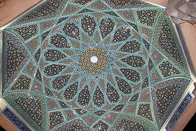
Tiled underside of dome of Tomb of Hafez[edit]


- Reason
- The image is large, and detail is good, and although the quality is slightly lacking at full size, I think it still meets the criteria sufficiently. It is one of the best modern images we have of the tomb of an important Iranian figure, Hafez. I think it's pretty, too . . . does that help? ;-) The main article, Tomb of Hafez, is a new article created at the beginning of June and it appeared on the main page as a DYK, along with this image.
- Articles this image appears in
- Tomb of Hafez, arabesque, Islamic interlace patterns
- Creator
- Pentocelo
- Support as nominator —Maedin\talk 15:19, 18 August 2009 (UTC)
- Added alternative: Just found another image which is larger, shows more of the structure, highlights the enamelling of the tiles, and is probably better quality. Perhaps this is a good replacement for the original? Maedin\talk 15:35, 18 August 2009 (UTC)
- Alt looks to be awkwardly composed and/or cropped to me, and possibly suffering from lens distortion, and I find it quite disorienting. --jjron (talk) 07:41, 19 August 2009 (UTC)
- Oppose all - subject cut off. Additionally, the alternate is poorly framed. MER-C 08:21, 19 August 2009 (UTC)
- Support original good Ev and interesting --Muhammad(talk) 11:51, 19 August 2009 (UTC)
- Oppose Alt Support Original - The alt. is
bad framingframed badly and the framing makes it seem very confusing... although a positive note is you can see the calligraphy that usually accompanies the arabesque style in the alt. I like the original. I agree that it is cut off, but would a change in the caption help? Maybe instead of just saying "The underside of the dome" say something like "a close up of the underside of the dome" and mention something about showing the detail of the tiles or that it is the center of the dome only... Just a thought. I also think it is a nice addition to the arabesque section as this type of tile design is not shown. Zulualpha (talk) 14:38, 19 August 2009 (UTC)
- Support Original (oppose alt). wadester16 13:24, 20 August 2009 (UTC)
- Oppose all - You wouldnt know it was a roof... --Childzy ¤ Talk 15:05, 20 August 2009 (UTC)
- That's what the caption's for. Would you know what this or this was without a caption? wadester16 01:07, 23 August 2009 (UTC)
- I've been perplexed by your oppose, Childzy. Would the technical quality or the EV of the image somehow be heightened if it were instead a picture of a floor, or a wall? Maedin\talk 07:05, 23 August 2009 (UTC)
- Oppose – reluctantly, as I'm a big fan of arabesque art. Getting a good shot of a subject like this is full of "traps" and this one has fallen foul of all of them. There's invariably a kind of organic symmetry that defies camera placement, poor lighting that shows the shape of the work but which additional lighting (like flash) wipes out and a superb use of space that's nigh-on impossible to capture in two dimensions. It can be done well but it hasn't been here. I might have weak supported had detail not been lacking to such an extent that it looks like a watercolour illustration, which judging by the poor crop might have been preferable. Basically, if you attempt to depict patterns and symmetry they should avoid perspective distortion and be framed with at least a vague attempt at squaring up at the edges. Some better examples here show the sort of thing I'm on about. --mikaultalk 06:23, 24 August 2009 (UTC)
- Yep, I suppose it is suffering from a lack of all of those things. The examples you linked to all benefit from being a rather simplistic, easily-captured, square-on sort of tiling. The shape and the position of the dome pretty much excludes doing it to that standard, unless one has mad skills, a panoramic head on a tripod, and the political or moneyed sway to get the tomb removed from the centre of the structure. Not sure how necessary the last one is, but hopefully you get my point. However, as Diliff has said before, not everything is capable of being a featured picture, no matter how much skill and equipment you throw at it. So that's ok, :-) Thank you for explaining your oppose so well! Maedin\talk 07:19, 24 August 2009 (UTC)
- Yer welcome! FWIW I think there could well be an FP there, either choosing a slightly less graphic approach [1] or (as you say) get serious and set the same shot up properly. Half the problem is attempting the latter without dedicating the time to it, and it's a really tough shot to get right. --mikaultalk 08:53, 24 August 2009 (UTC)
Not promoted --Shoemaker's Holiday Over 200 FCs served 10:18, 24 August 2009 (UTC)
