
User:Tweedle/Population pyramid
This page is intended to serve as a guide on how to create a workable population pyramid on Excel. This guide may not be the fastest, quickest or least convulated way but serves as a simple stepping stone on how users can create one, users are free to experiment on methods which they prefer in making one.
You will need;
- Excel (or any data spreadsheet software)
- Notepad
What is a population pyramid?[edit]
A population pyramid is a chart which shows the sex and age distribution of an area (normally country). It allows us to view age demographic cohorts, surplus populations within the sexes and in general age structure of an area. Population pyramids can be created for almost everywhere if the age and sex structure data exists, from small towns to city wide regions to continents.
- Population pyramid examples
-
 Kyiv population pyramid January 2022
 -
 Ukraine population pyramid in 2023
 -
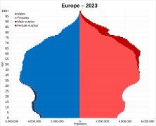 Europe population pyramid in 2023
 -
 World population pyramid


Creating your population pyramid[edit]


Get your data[edit]
Grab your age and sex structure dataset from the respective country's statistical authority you will be creating a population pyramid from. Population pyramid graphs can be made of any lower level geography so long as the data exists but generally the most well known versions of population pyramid graphs are for respective countries. In this guide, I will be using UN World Population Prospects, 2022 Edition data (which can be accessed via their data portal) on Ukraine's projected population pyramid in 2045.
Data relating to age and sex structure population graphs usually are either single year datasets (which will go up to max age caps of 80 to 100+ depending on the country) or 5 year age structure data (for example 0-4, 5-9 etc. which will cap to a range of either 70 to 90+). Typically it will depend on the country whether or not they have produced single year datasets but all statistical authorities *should* atleast have 5 year age structure data. There is not much difference betwene the two on how to create a graph other than it takes less time needed to create a 5 year age structure graph as it is less values to compute on.
Once you have saved your data, head to Excel where we can begin
Applying age structure[edit]
Once you have your data from the respective countries statistical authority or from in my case the UN World Population Prospects database, open a new sheet and copy the ages going down the side of the base data excel file (which has your age structure data), you will need these for your Y Axis on the graph (or you can create a column of 100 simply by inputting 0 on one cell, then =SUM(The cell where 0 is +1) below it, then copying that and dragging it down then pasting.)
Then, copy the individual sex and age data for each sex, put the Male values on one cell away from the Ages going down and the Female values next to the Males on the right . Once you have done this, it should look like that of on the right on Guide 1
Calculation for surpluses[edit]
Now that we have our data applied along the columns, we should now create our surplus population for Females and Males. To do so, we want to in a seperate column away from which will be our 4 main columns of data (this can be anywhere), do the =SUM formula in a cell and minus the two cells together, in this instance I minuses the Female population againest the Male population as shown in Guide 2.
Apply this sum formula down the column, it will then produce the the surplus for each age group as demonstrated in Guide 3. Highlight the surplus values you have created, copy and paste the data into Notepad, then copy the values from Notepad itself and apply them on. This will remove the SUM formula.
Now with the surpluses still highlighted, scroll all the way to the bottom and click the Quick Analysis button which will appear and apply the Greater Than formatting, set the number to 0 and this will help you easily identify the surpluses from each other. From here, we now need to do the final steps in order to complete our population pyramid graph.
Applying the surpluses and final steps[edit]
Now we need to apply our surpluses into their respective columns for our graph. In this stage, Guide 4 as image help, we apply the respective data into their columns of the negative integers as our Male surplus, and the positive integers as our Female surplus.
Once we have accomplished this, we now need to equalise the base Male and Female population so that we do not double the surplus we have calculated. Using Guide 5 as image help, we then apply the respective populations into their base figure, for the intial starting figures before we reach the Female surplus, we apply the female population into the male population column to equalise.
You will now need to flip the Male values into negative integers so that the stacked bar graph can be utitlised properly. Put -1 into a random cell, copy the number and then highlight the entirety of the Male column and right click it. You will then need to click 'Paste Special'. Once doing so, you will be greeted with a box which will contain lots of options, we need to now select 'Multiply' and then OK. This will convert our values into negative numbers.
After doing all this, we should be in a stage where we can now apply our data into a graph form. Highlight all of the data you have created, go to 'Insert' at the top of Excel, look for the bar symbol and select Stacked Bar Graph, if done correct, we should now have our (albeit ugly) population pyramid in Guide 6!
Adjusting the chart[edit]
Recommended settings[edit]

Now that we have our chart, how can we make it look a bit better?
I recommend;
- Shift 'Male surplus', to the edges of the stacked bar graph
- Male surplus, by default of where it is placed, may be in the inner inside bit of our graph and needs to be pushed out to match up with Female surplus which is correctly on the outer bit of our chart. To change this, we need to right click on the inside of our chart, then click 'Select Data' and move Male surplus in the Legend entry below Females and above Female surplus.
- Right click on the bars on the graph, click 'Format Data Series'
- Here it will bring up a list on the right, if done correctly it should show 'Series Options' and a value for 'Gap Width', change Gap Width to 0, this should completely reduce the amount of gaps between the databars which will significantly improve the look of the graph. If the bars do not synchronise together, this is likely the problem of Series Overlap, adjust that by setting it at 100% to fix.
- Fill the colours of the different values in:
- It's most likely warranted and for easier visualisation, let's change our colours of our different values (Male surplus, Males, Females and Female surplus) to different gender co-ordinate colours, or to any of your choosing. Click on our respective bar values individually on our graph. Change the colour by clicking the paint bucket after going to Format Data Series and change the fill colour to your liking. On mine it is for hex codes;
- Male: #0070C0
- Female: #FF5050
- Male surplus: #2F5597
- Female surplus: #FF0000
- It's most likely warranted and for easier visualisation, let's change our colours of our different values (Male surplus, Males, Females and Female surplus) to different gender co-ordinate colours, or to any of your choosing. Click on our respective bar values individually on our graph. Change the colour by clicking the paint bucket after going to Format Data Series and change the fill colour to your liking. On mine it is for hex codes;
- Format the Axis:
- You will need to adjust three things. Firstly, click on the bottom Population X Axis, right click and go to Format Axis, search down for 'Number' and open the closed box, You will need to change the category, which is default set to General to Custom. This will allow us to remove the minus symbols from our X axis. From there, click on the Format code box and remove the minus symbol within it, it should be next to the semi-colon, then click Apply. Once you have done this, you will have fixed the X Axis.
- Secondly, We now need to fix the Y Axis. Click on the Y Axis and right click to get Format Axis. Set the Axis to be 'On tick marks' as appears and click the Labels and Tick Marks closed sections. First change the label position to 'Low'. Then Specify Interval Unit and set it to 5 (or your choosing), do the same in the Tick Mark section with 'Interval between marks'.
- Lastly, we will want to also add in gridlines. Click on our Y Axis and right click and add 'Major gridlines', we can adjust the opacity and width etc. by clicking the lines themselves and going to the paint bucket label.
After these few tweaks of mine (and doing a few things not mentioned on here with the title boldness and size of the labels which can be adjusted by changing the font size) we produce this in Guide 7, our own population pyramid graph!
